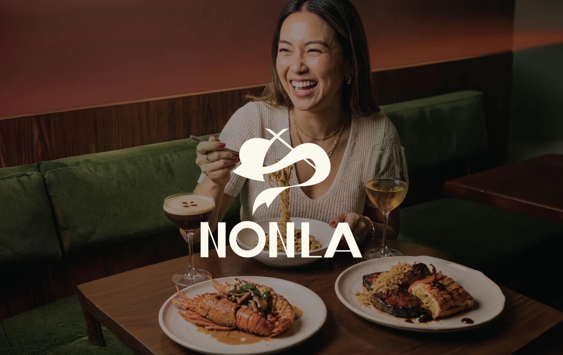
Vietnamese restaurants outside Vietnam tend to pick one of two looks. Street-food nostalgia, with bamboo, lanterns and plastic stools. Or a vague pan-Asian luxury that could be anywhere. Nonla is neither. It's a proper evening out, velvet booths, wine, lobster, cooked from Vietnamese tradition. The brand had to hold both halves without apologising for either.
Restaurant
Nonla
A Vietnamese dining room that doesn't rely on lanterns.
Take three symbols everyone already knows, chopsticks, the dragon and the nón lá, the conical hat the restaurant is named after, and draw them as one mark. Familiar enough to read as Vietnamese in a second, drawn freely enough that it feels made now, not copied from a postcard.
The work
The mark over the room itself. The first thing to establish was that this is a place for an evening, not a quick lunch.
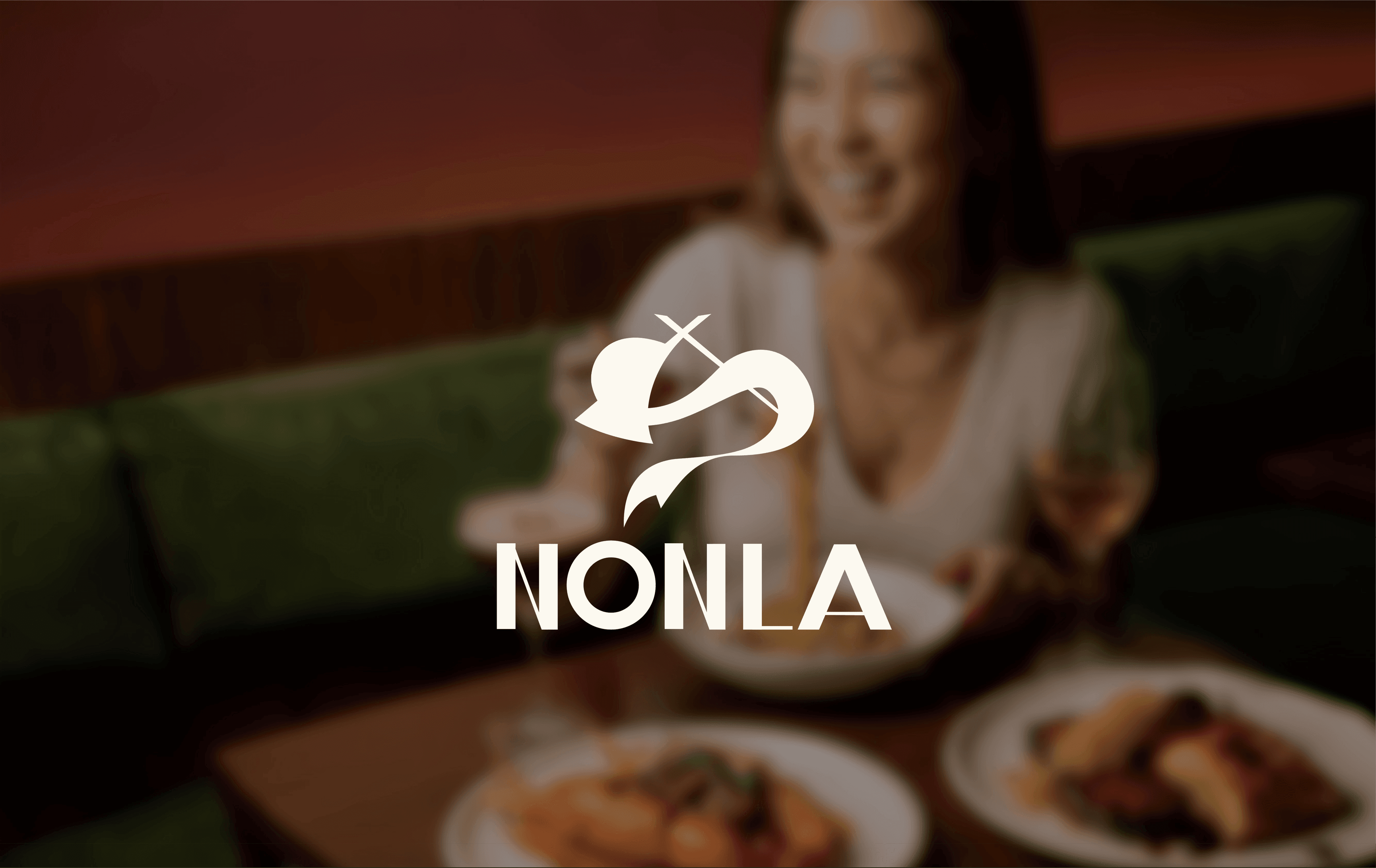
Chopsticks, dragon, conical hat. Three references, one shape. The brand's archetype is the Creator, so the mark had to look drawn, not assembled.
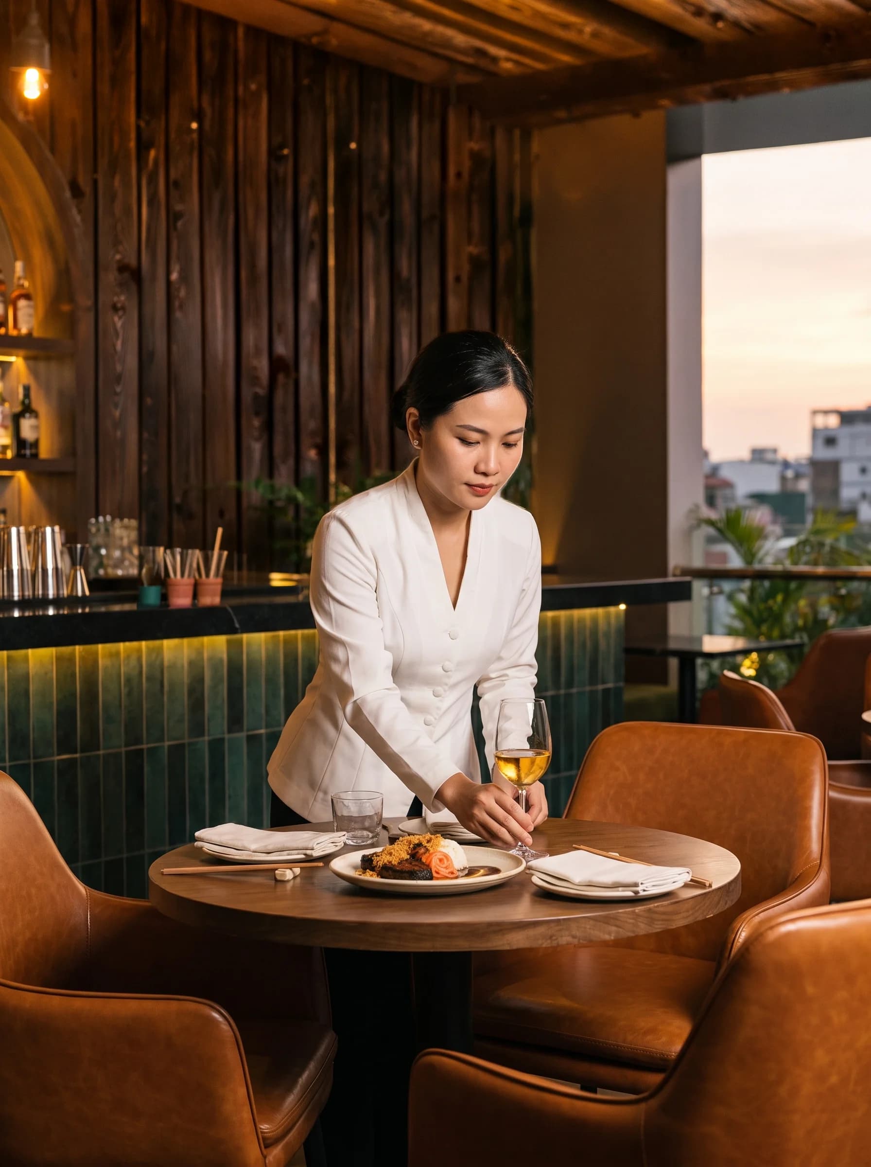
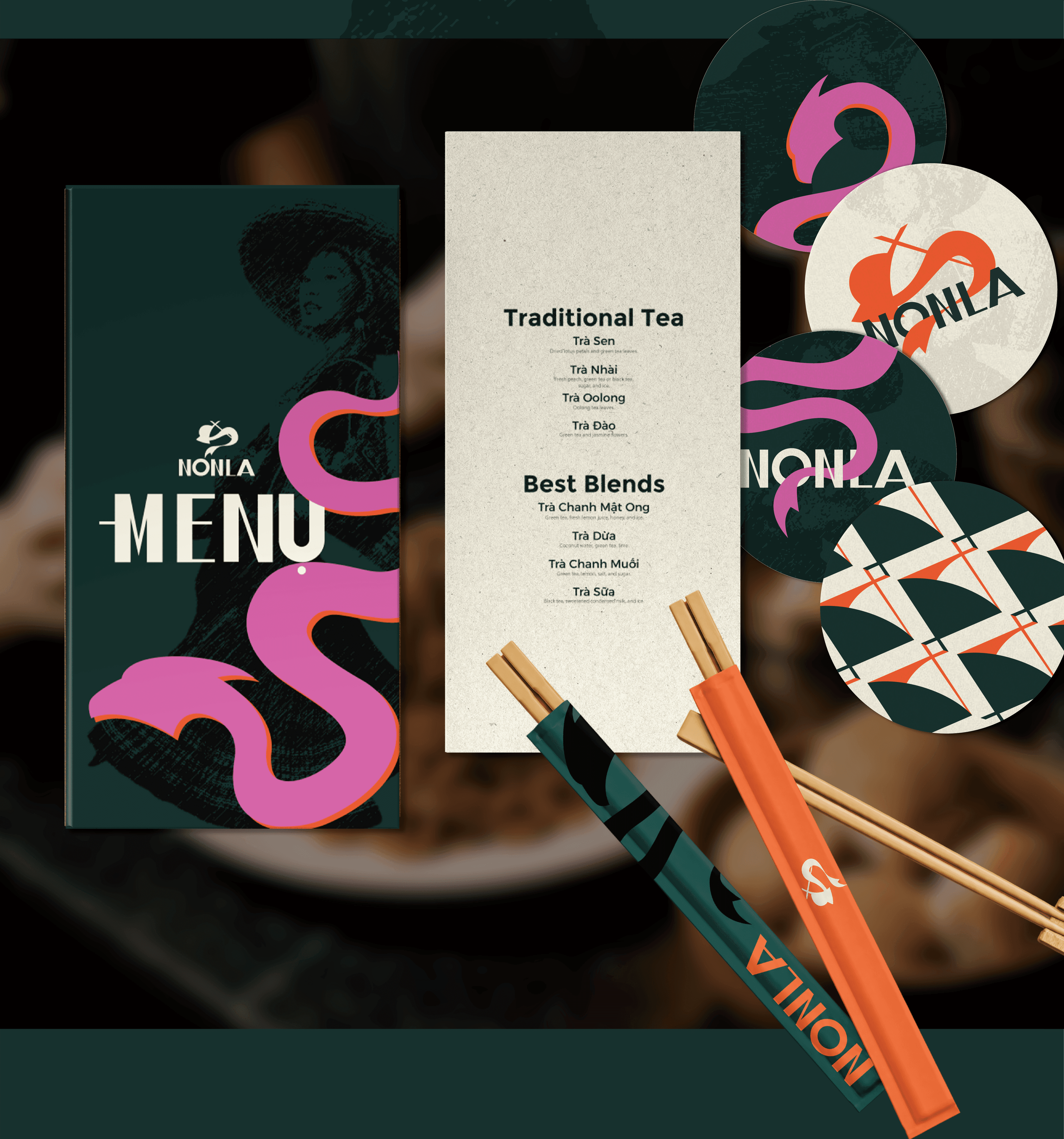
Forest green from the room, cream from the paper, then pink and orange pushed further than the category usually goes. The dragon is the loudest thing on the table on purpose.
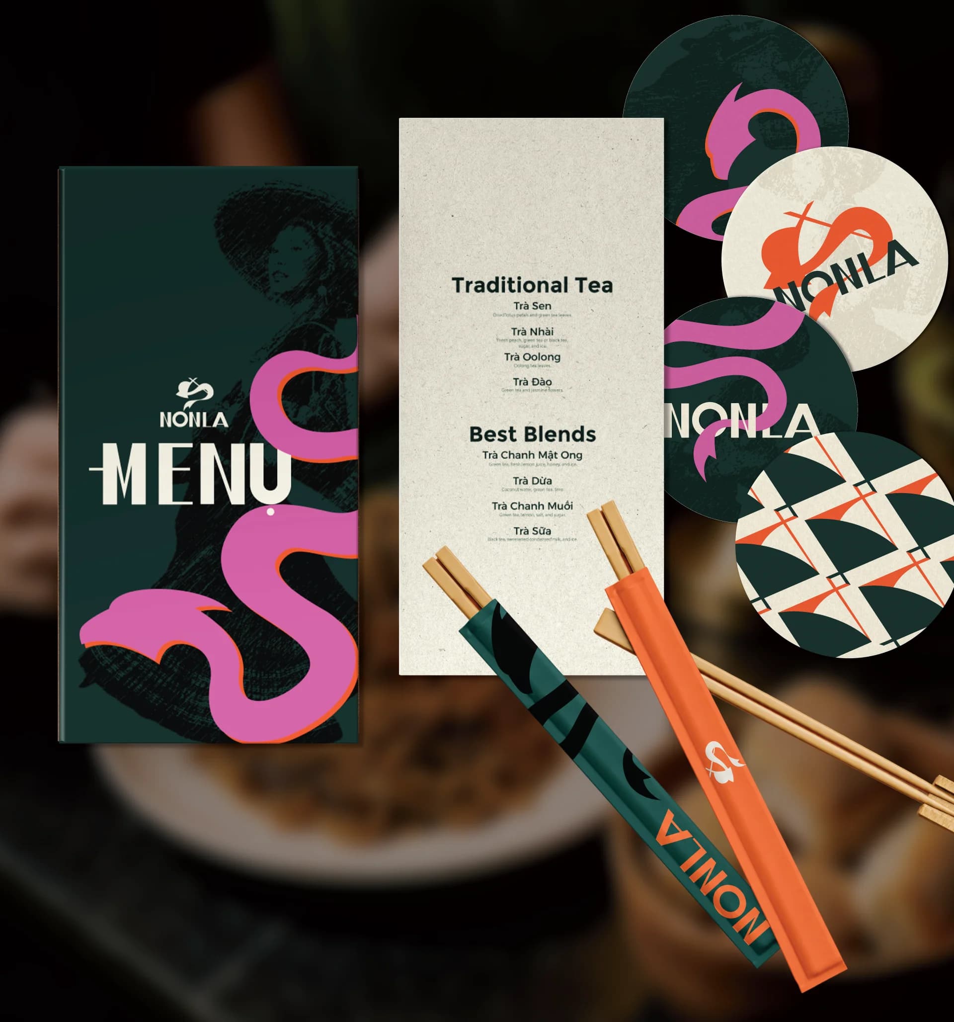
The menu and the tea list keep their Vietnamese names first, Trà Sen, Trà Nhài, with English underneath. Translating them away would have removed the point. Around them sit the coasters, the chopstick sleeves and a pattern built from the geometry of the hat. Small objects that guests pick up, photograph and sometimes take home.
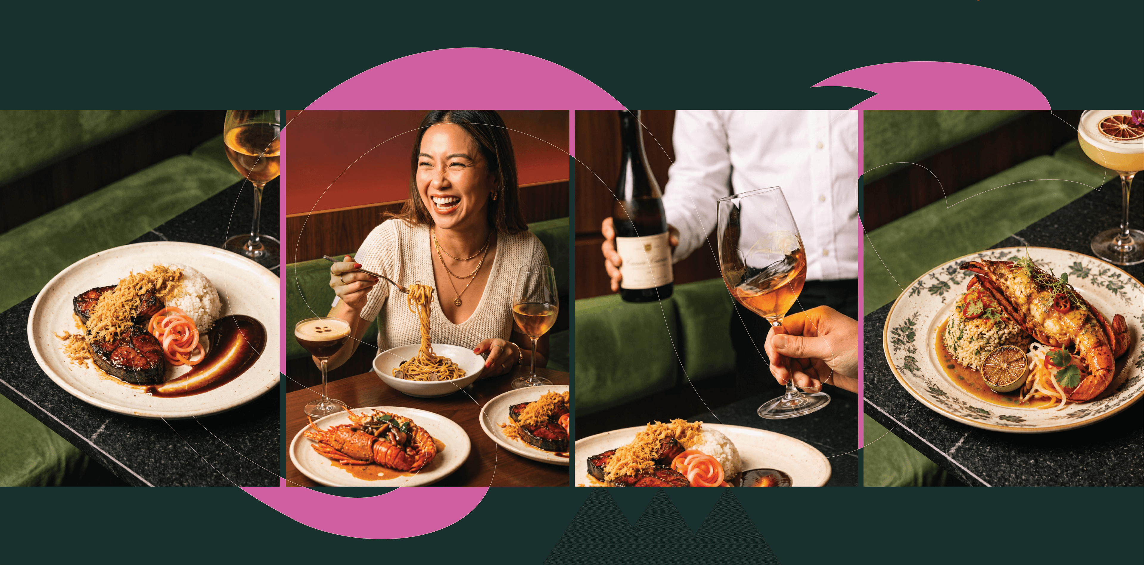
Low light, real booths, full plates, people mid-laugh. The dragon runs across the frames and ties them into one sequence.
A short vertical film for launch, built for the phone first.
This is a self-initiated project. It shows how a restaurant can carry its culture proudly without turning it into decoration.