Seafood restaurants decorate themselves with the sea. Rope, anchors, nets, blue and white stripes. It's everywhere, so it says nothing. And every one of them says "fresh", which no one can check from a menu. Marisco has been on the water since 1940. It didn't need to borrow the sea's props. It needed to show what it actually does.
Hospitality, food and beverage
Marisco
A seafood restaurant where the catch is the brand.
Stop decorating with the sea and show the distance between the boat and the plate. The mark does it in one line: a fish and a hook drawn as a single stroke. The catch and the skill it takes to land it, in one gesture. Everything else stays quiet so the food can be loud.
The work
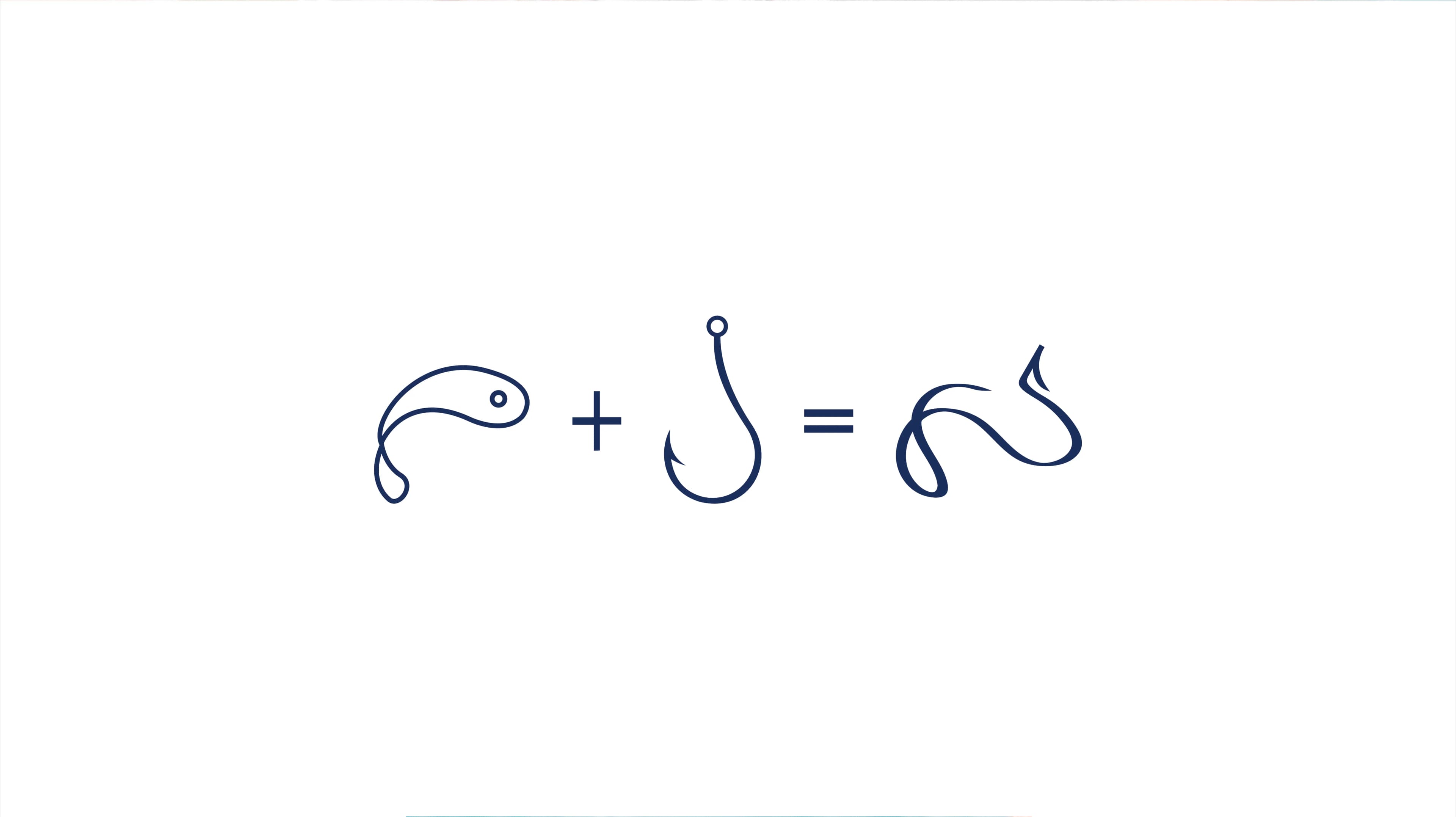
Fish plus hook equals Marisco. One continuous line, so it works embroidered on an apron as well as it does on a sign.
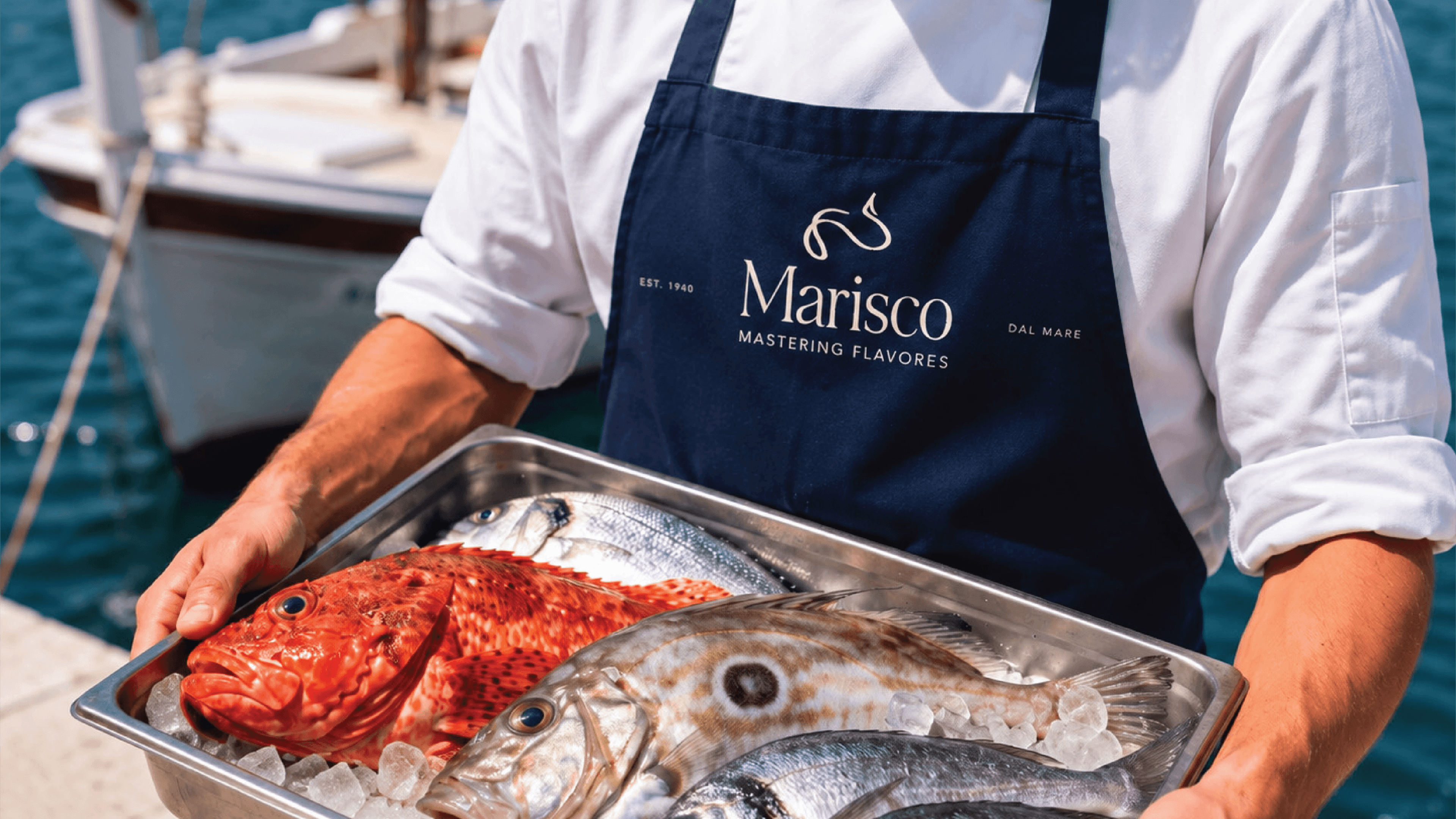
Deep navy and white, nothing else. Navy is the colour of open water, not the bright nautical blue everyone else uses. The food brings all the colour the brand needs.
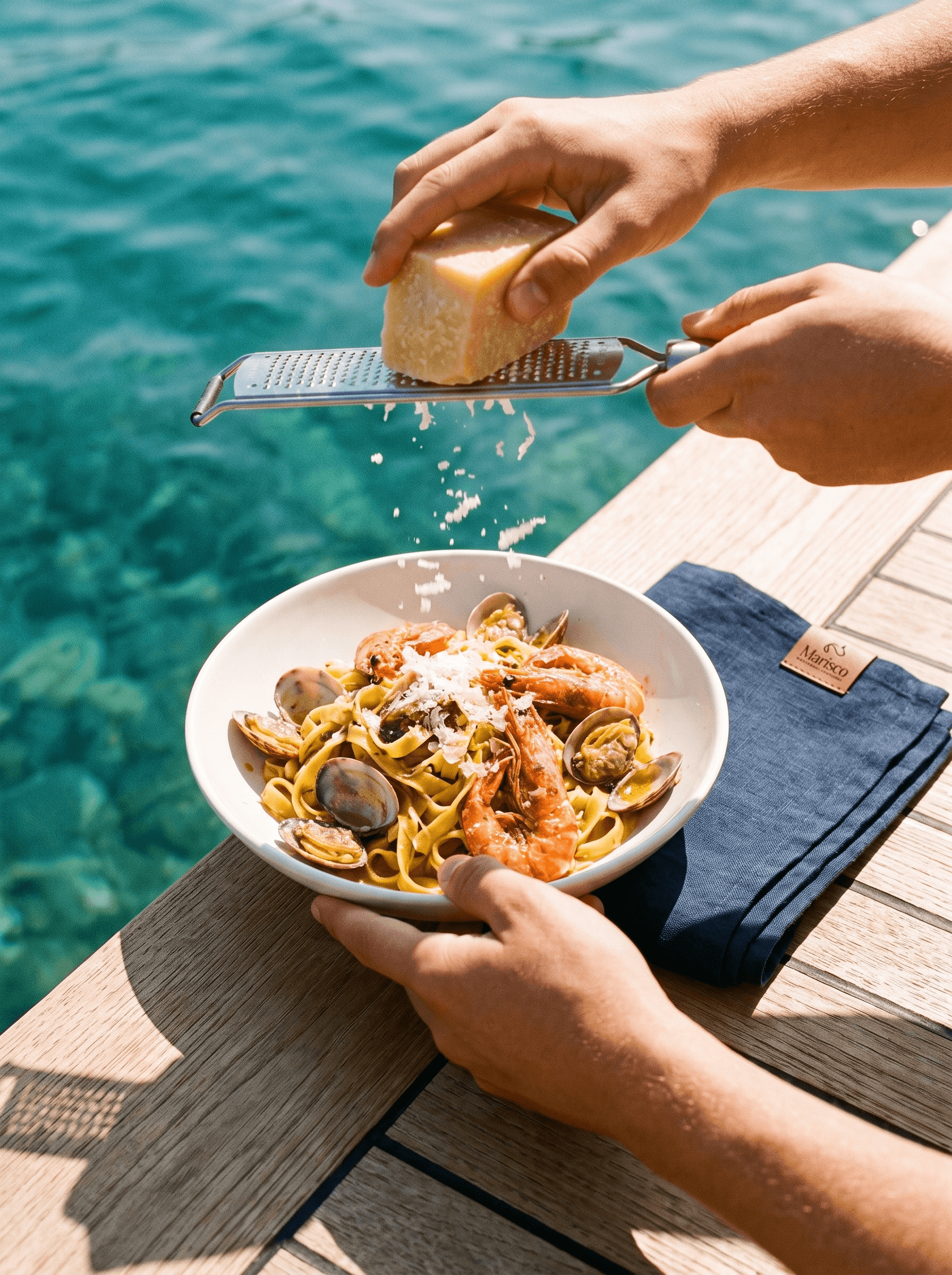
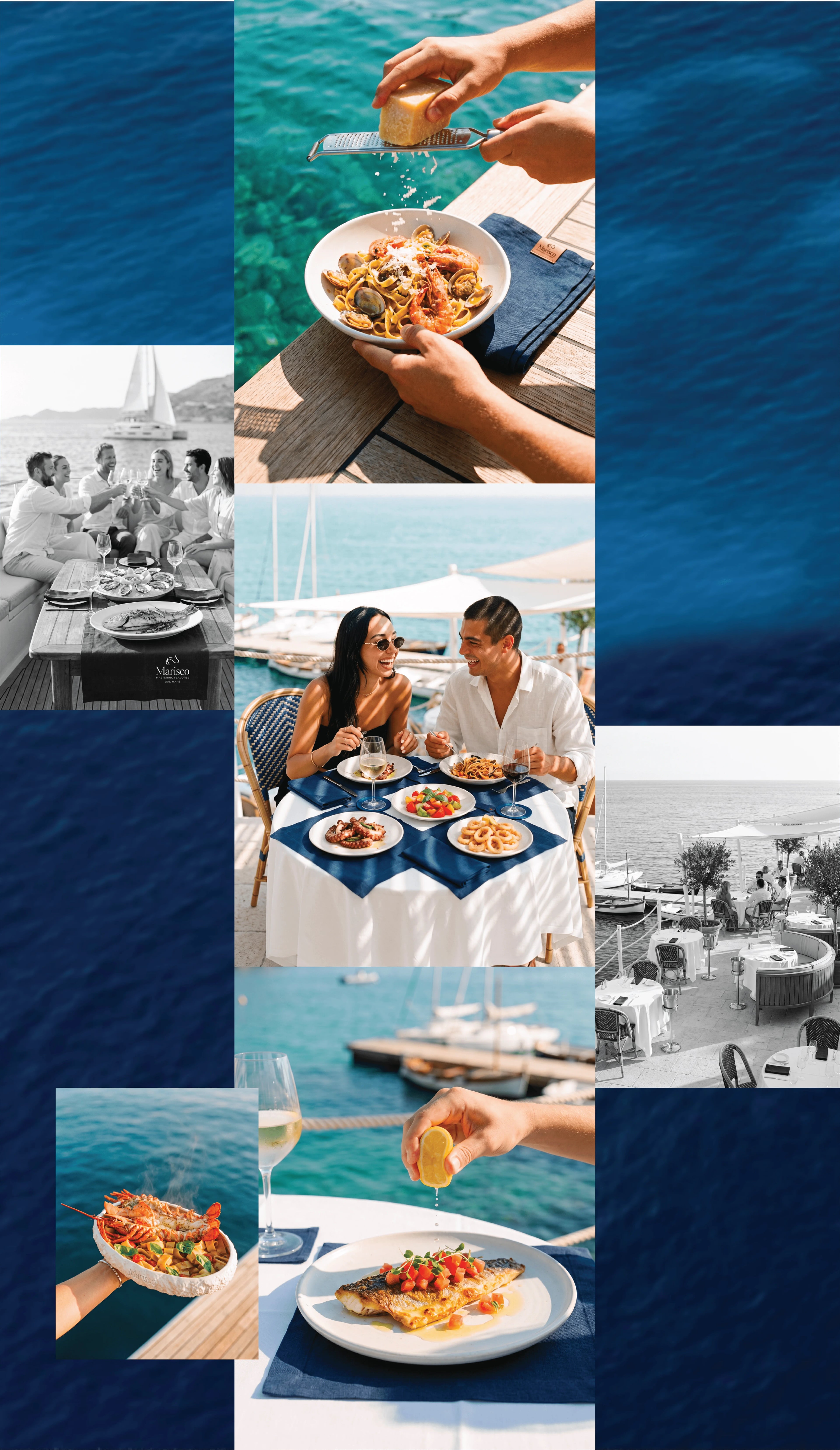
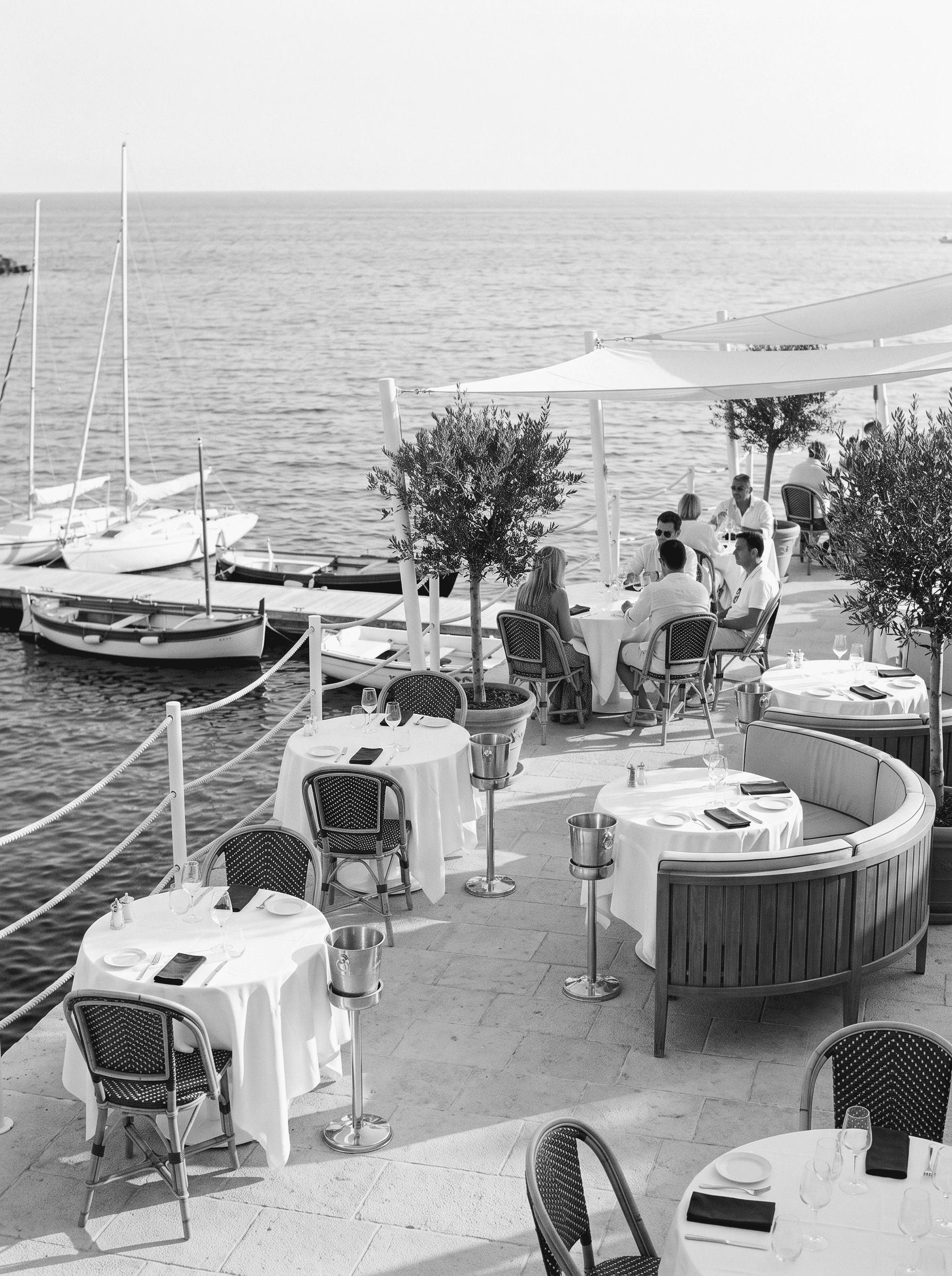
Shot in daylight, on the water, with hands in the frame. People eating, not plates posed on a table. The place is in black and white, the food is in colour, so the food always wins.
The mark lives on the apron and a woven label on the napkin. Small, stitched, not printed. It's the kind of detail guests notice on the third visit, not the first.
This is a self-initiated project. It shows how a restaurant with a long history can look current without pretending to be new.